How To Put A Border In Excel

Hey there, fellow spreadsheet wranglers! Ever feel like your Excel sheets are just… floating out there in the digital ether? Like a really important grocery list that’s lost its shopping cart? Well, guess what? We’ve got a super simple trick that’s going to make your data look so much tidier, it’ll be like giving your information a tiny, stylish outfit. We’re talking about putting a border in Excel!
Now, before you go thinking this is some complicated tech wizardry, let me assure you, it’s easier than making a cup of tea. Think of borders like the picture frames for your precious photos. Without a frame, a beautiful photo can look a bit lost on a wall, right? It doesn't quite have that “wow” factor. Borders do the same for your Excel data. They define it, make it stand out, and help your eyes know exactly where one piece of information ends and another begins. Handy, especially when you’re trying to impress your boss with a report that looks as professional as it is informative, or even just trying to keep your personal budget from looking like a toddler’s finger painting.
Let’s dive in. Imagine you’ve got a list of your favorite pizza toppings. You’ve meticulously typed them all out, from pepperoni to pineapple (yes, pineapple lovers, I see you!). But right now, it’s just a jumble of text. It’s like all your pizza ingredients are scattered on the counter instead of being neatly arranged in their containers. A border can change that. It can group your toppings together, making your “Pizza Topping Paradise” list look organized and ready for action.
Must Read
The Magic Wand: Finding the Borders
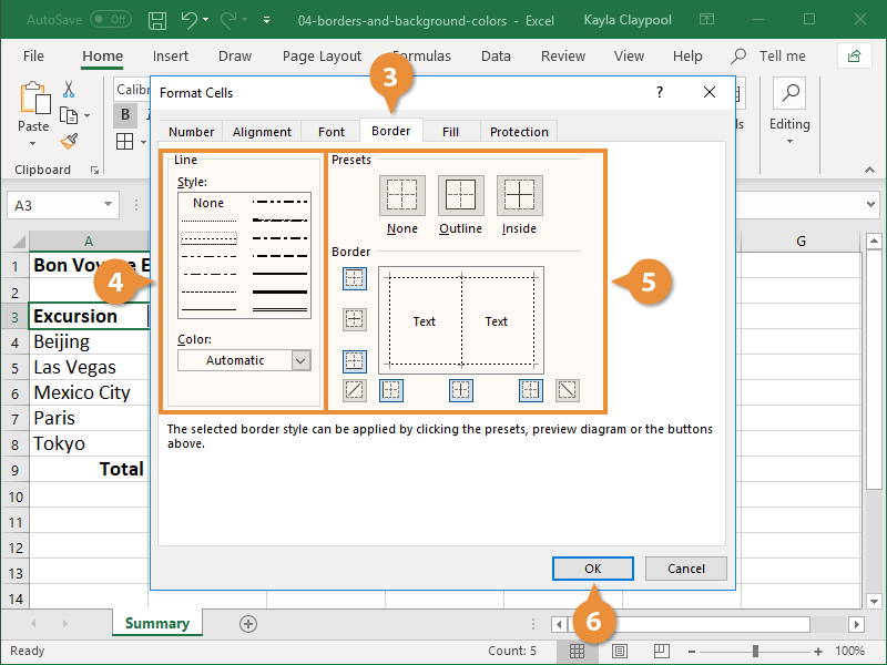
So, where do we find this magical border-applying tool? Fear not, it’s not hidden in some secret Excel dungeon. It’s right there, usually in plain sight on the Home tab, within the Font group. See that little square with lines on it? That’s your border button! It’s like the secret handshake of spreadsheet design.
Click on that little dropdown arrow next to it, and you’ll see a whole array of options. We’ve got “All Borders,” “Outside Borders,” “Thick Outside Borders,” and even fancy ones like “Top Border” or “Right Border.” It’s like choosing the right frame for your painting – you’ve got options!
Your New Best Friend: "All Borders"
For most of us, the go-to border is going to be All Borders. Think of this as putting a tiny, neat fence around every single cell you’ve selected. It’s the equivalent of giving each of your pizza toppings its own little personal space on the list. This is fantastic for creating clear tables. It’s like building a perfectly organized shelf for all your canned goods – everything is visible, defined, and easy to find.
Let’s say you’re tracking your monthly expenses. You’ve got columns for “Date,” “Item,” and “Cost.” Without borders, it can be a bit of a visual maze. But with “All Borders,” suddenly, each row pops out, clearly separating your rent payment from your coffee habit. It’s like turning a messy pile of receipts into a beautifully organized ledger. Your future self will thank you, especially when tax season rolls around!
"Outside Borders": For When You Want to Frame the Big Picture
Sometimes, you don’t need a fence around every single post. Maybe you just want to put a nice, sturdy frame around your entire table of data. That’s where Outside Borders comes in. This is perfect for making your main heading or your complete data set stand out from the rest of the worksheet.
Imagine you’re creating a schedule for your kid’s soccer team. You’ve got dates, times, and locations. You probably don’t need borders around each individual date and time cell. But you definitely want to make that whole schedule look like a cohesive unit, clearly separate from, say, your notes about the snack schedule. “Outside Borders” is your friend here. It’s like putting a big, bold outline around the entire event information, making it instantly recognizable.
The Dramatic Flair: "Thick Outside Borders"
Feeling a little more adventurous? Want to add some oomph to your table? Try Thick Outside Borders. This is like going from a standard picture frame to one with a bit more heft and presence. It really makes your selected area pop.
This is especially useful for the very top of a report, or for a key summary figure. If you’re presenting sales figures for the quarter, using a thick outside border around the total sales will make that number scream, “Look at me! I’m important!” It's the visual equivalent of shouting from the rooftops about your amazing success.
A Little Story: The Great Vacation Budget Fiasco
Let me tell you about my friend, Sarah. Sarah is amazing at planning elaborate vacations. Last year, she decided to budget for a big trip to Italy. She created this massive spreadsheet with flights, hotels, food, souvenirs – the works. But she didn’t use borders. Everything was just… there. And when she tried to present it to her husband, it looked like a jumbled mess. He kept asking, “Wait, is that the cost of the gondola ride or the gelato?”
Sarah, bless her heart, was frustrated. She’d spent hours on it! So, I showed her the magic of borders. We applied “All Borders” to her detailed list and then a “Thick Outside Border” around the grand total. Suddenly, her spreadsheet went from a confusing jumble to a clear, concise, and frankly, quite beautiful budget. Her husband looked at it, nodded approvingly, and said, “Okay, Italy, here we come!” All thanks to a few simple lines. It’s funny how something so small can make such a big difference, right?
Why Should You Care About Borders?
Okay, so beyond making your spreadsheets look prettier (which, let’s be honest, is a perfectly good reason!), why else should you bother with borders? It all comes down to clarity and readability.
In our busy lives, we often glance at information. We don’t always have time to meticulously scan every cell. Borders act as visual cues, guiding our eyes and helping us process information faster. Think about a menu at a restaurant. The clear separation between appetizers, main courses, and desserts makes it so much easier to decide what you want, doesn’t it? Borders do that for your data.
They also help prevent information overload. When a sheet is a sea of text with no definition, it can feel overwhelming. Borders break it down into manageable chunks. It's like having a beautifully organized pantry versus a chaotic cupboard where you can't find anything. Which one would you rather work with?
And let’s not forget about professionalism. Whether you’re sharing a budget with a family member, a work report with your boss, or a complex data set with colleagues, a well-formatted sheet with borders just screams “I know what I’m doing!” It shows you’ve put in the extra effort to make your information easy to understand. It’s the difference between a hastily scribbled note and a carefully crafted letter.
Beyond the Basics: A Peek at the Other Options
While “All Borders” and “Outside Borders” are your workhorses, don’t forget about the other options in that dropdown menu. Need to highlight the total row in your monthly report? Use a Bottom Border. Want to separate different sections within a larger table? Use a Right Border or a Left Border.
You can even get creative and combine them! Select a range, apply “Outside Borders,” then select a specific row within that range and add a “Bottom Border.” The possibilities are endless, and they all lead to a more organized and visually appealing spreadsheet. It’s like having a box of crayons – you can use them one at a time or mix and match for a masterpiece.
Putting It All Together
So, here’s the simple process:
- Select the cells you want to add borders to. Think about the exact area you want to define.
- Go to the Home tab.
- Find the Font group.
- Click the little dropdown arrow next to the Borders button (the square with lines).
- Choose your border type. Start with “All Borders” or “Outside Borders” and experiment from there!