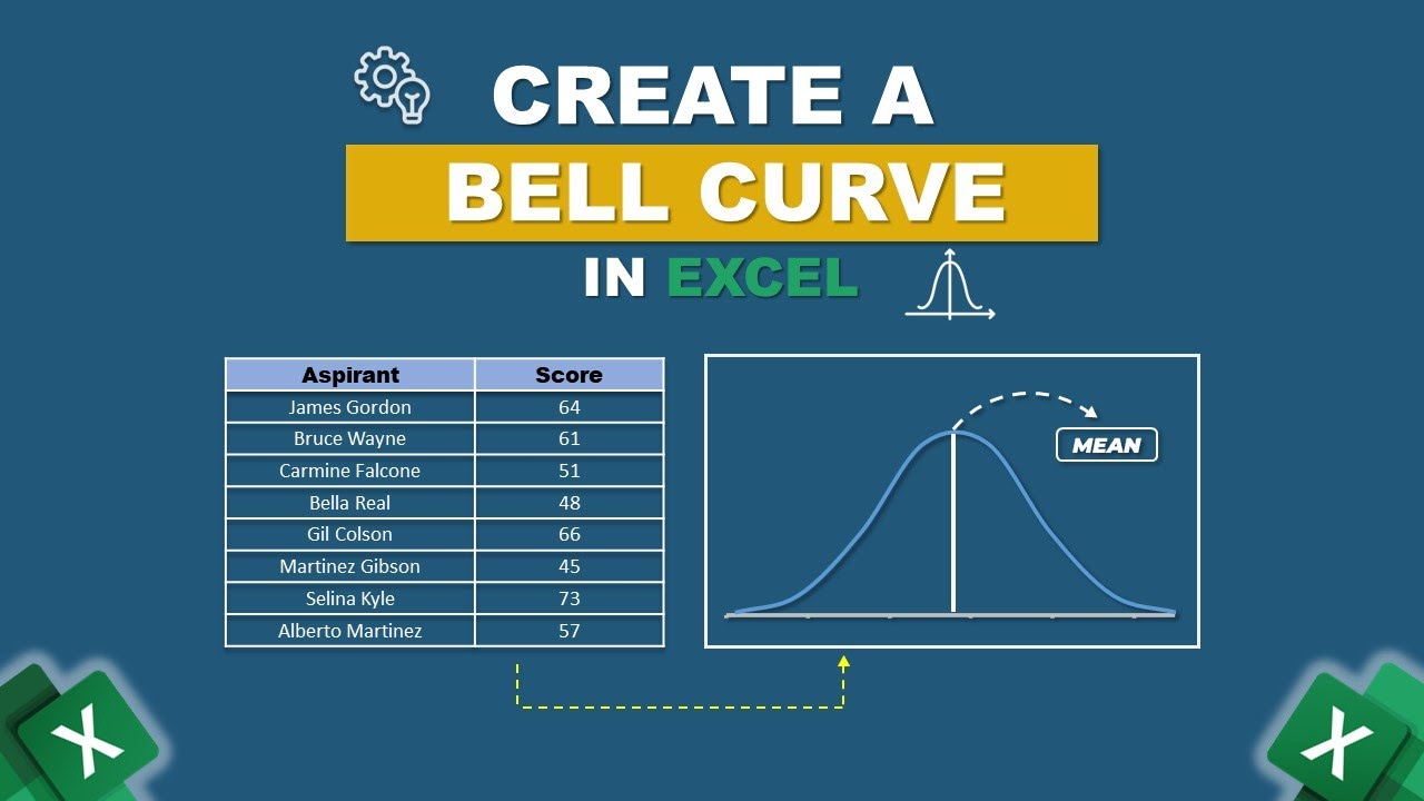
How To Draw Bell Curve In Excel
Ever found yourself looking at a set of numbers and wondering what the "typical" or "average" looks like? Maybe you've seen those smooth, humped-shaped graphs in textbooks or news articles and thought, "That looks interesting, but how did they do that?" Well, get ready to unlock a little bit of that magic, because today we're diving into the wonderful world of drawing a bell curve in Excel. It's not as intimidating as it might sound, and honestly, it's pretty fun to see your data take on this classic shape.
So, what exactly is a bell curve, and why should you care? In a nutshell, a bell curve, also known scientifically as a normal distribution, is a way to visualize how data points tend to cluster around a central average. Imagine measuring the heights of 100 people. You'd likely find that most people are around an average height, with fewer people being exceptionally tall or exceptionally short. The bell curve perfectly illustrates this phenomenon, showing a peak at the average and gradually tapering off on either side.
The beauty of the bell curve lies in its ability to help us understand patterns and variability. It's a fundamental concept in statistics, but its applications stretch far beyond the classroom. In education, teachers might use it to understand the distribution of test scores, identifying if the majority of students performed as expected, or if there's an unusual spread. Think about grading on a curve – that's directly related to understanding how your scores compare to the overall distribution.
Must Read
Beyond education, you'll see bell curves popping up everywhere. In manufacturing, it can help monitor the consistency of product dimensions. In finance, it might be used to model asset returns. Even in everyday life, understanding the normal distribution can give you a better perspective. For instance, if you're looking at the average commute time for your city, a bell curve can show you how much variation you can typically expect, helping you plan your journey more effectively. It helps us move from simply seeing a bunch of numbers to understanding the story those numbers are telling.
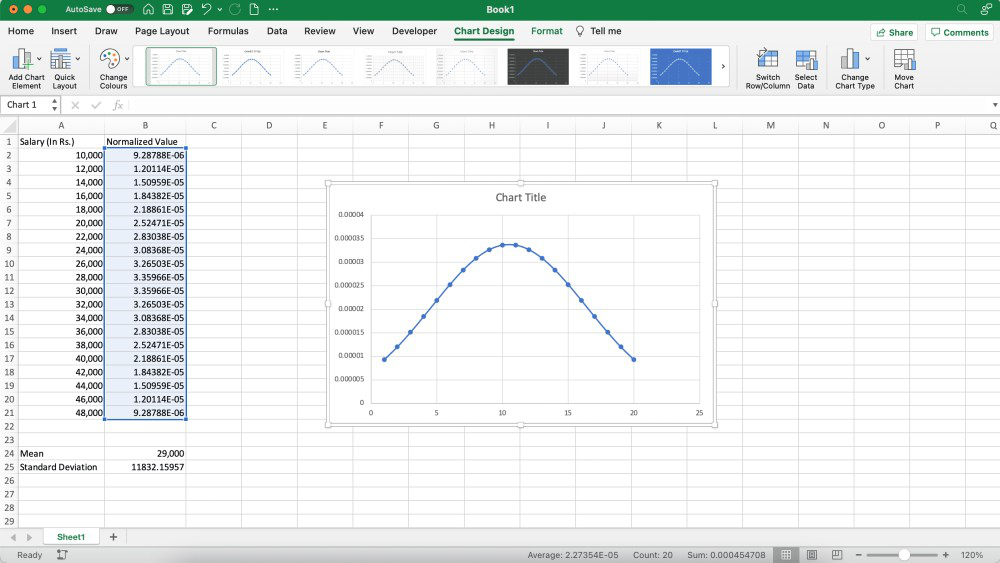
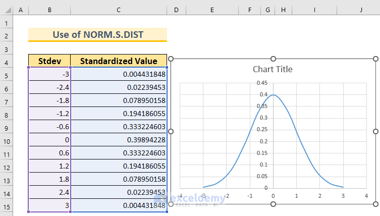
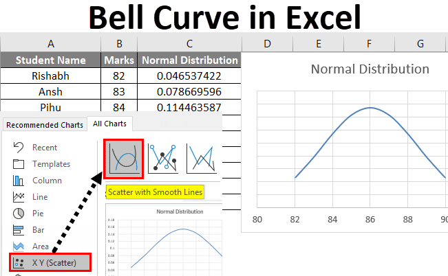
Now, how do we get Excel to draw this for us? It's surprisingly straightforward. The key is to have your data ready. Once you've got your numbers, you'll typically use Excel's built-in Analysis ToolPak. If you don't see it, a quick search online will show you how to enable it – it's usually just a few clicks under Excel's Options. From there, you'll select the 'Histogram' tool. You input your data, and crucially, you select the option to 'Chart Output'. Excel will then do the heavy lifting, generating both the frequency table and a graphical representation of your data's distribution. You might need to do a little tweaking of the bins (the ranges for your data) to get the smoothest bell shape, but that's part of the fun of exploration!
Don't be afraid to play around! Try entering different sets of numbers – random numbers, your own test scores, or even the results of a simple dice roll. See how the shape changes. The more you experiment, the more intuitive drawing and understanding a bell curve in Excel will become. It's a fantastic way to add a layer of statistical insight to your spreadsheets and gain a deeper appreciation for the patterns that shape our world.