How To Do A Pie Chart In Word
Alright, gather 'round, you digital denizens and data dabblers! Today, we're embarking on a quest of epic proportions. A quest for… pie charts in Word. Yes, you heard me right. We're about to conquer the beast, the enigma, the slightly-less-exciting-than-an-actual-apple-pie pie chart, right within the hallowed (and sometimes bewildering) halls of Microsoft Word. Now, I know what you're thinking. "Pie charts? In Word? Isn't that like trying to teach a cat to do your taxes?" And to that, I say, hold your horses and perhaps a slice of actual pie, because it's not as terrifying as it sounds. In fact, it's about as complicated as deciding whether to have your crust sweet or savory. (Spoiler alert: it's always sweet.)
So, picture this: you’ve got some brilliant insights. You’ve crunched the numbers. You’ve wrestled with spreadsheets until your eyes are cross-eyed. And now, you need to present this groundbreaking information. But a wall of text? No, no, no. We need something visually appealing, something that screams, "Look at me! I'm important! And also, I represent a whole!" Enter the humble pie chart. It’s the undisputed champion of showing how parts make up a whole, like how coffee, existential dread, and a desperate need to finish this document make up my entire morning routine.
Now, before we dive headfirst into the digital abyss, let's get one thing straight. Word isn't exactly a Picasso of data visualization. It’s more like your slightly eccentric aunt who loves to knit. It gets the job done, but it might have a few… unique stylistic choices. But fear not! We shall navigate its quirks like seasoned explorers, armed with nothing but our wits and a willingness to click the correct buttons. Seriously, it’s mostly clicking buttons. If you can operate a remote control, you can probably make a pie chart. Probably.
Must Read
The Grand Opening: Inserting Your Canvas
First things first, we need a blank canvas. Open up your Word document. You know, the one with the blinking cursor that looks like it’s judging your life choices? Perfect. Now, head over to the Insert tab. It’s usually at the very top, nestled amongst the other tempting options like "File," "Home," and "My Social Life (currently unavailable)." Click on Insert.
See that little icon that looks like… well, a bunch of different chart types? It’s usually labeled Chart. Go ahead and give that a firm, yet respectful, click. Don't be shy. Word doesn't bite. Unless you're trying to use Comic Sans in a professional document. Then all bets are off.
A magical window will pop up, showcasing a dazzling array of chart types. We’re talking columns, bars, lines, scatter plots… it's like a data buffet! But today, our eyes are solely focused on the prize: the pie. Look for the one that resembles a delicious dessert being sliced. It’s usually right there, looking all innocent and circular. Click on it. Admire its potential.
Choosing Your Pie's Destiny
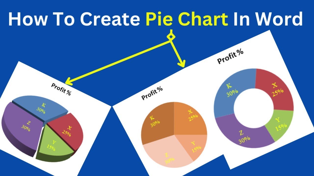
Word, being the helpful soul it is, will then present you with a few different pie chart variations. You've got your standard pie, your 3D pie (which adds a certain… je ne sais quoi, or maybe just a slight headache), and your doughnut chart (which is basically a pie that’s decided to go on a diet). For our initial foray, let's stick with the classic. The OG. The one that most closely resembles actual pie. Click OK.
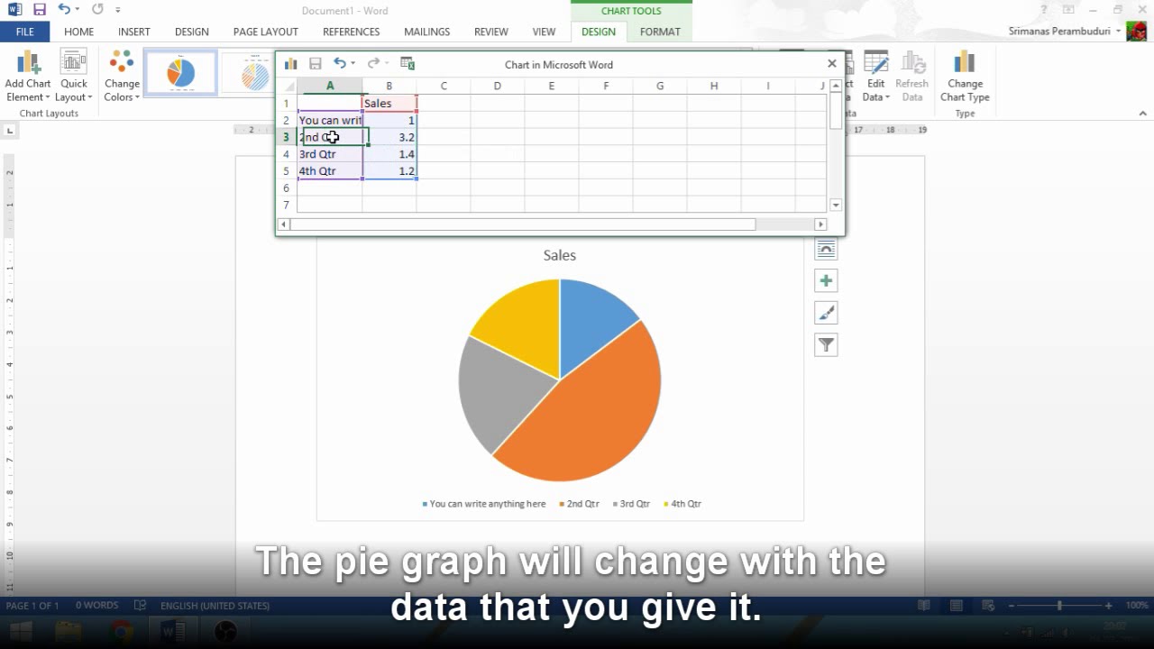
And lo and behold! A chart appears on your document, looking suspiciously empty. And next to it? A small, unassuming spreadsheet. This, my friends, is where the magic really happens. This is where you feed your pie chart its digital sustenance. Think of it as the ingredient list for your virtual dessert. Without these numbers, your pie chart is just an empty promise, a delicious-looking void.
The Nitty-Gritty: Filling Your Pie
Now, this spreadsheet might look a bit intimidating, especially if your last mathematical endeavor involved counting how many cookies were left in the jar. But fear not! It's incredibly straightforward. You’ll see columns labeled "Series 1," "Category 1," "Category 2," and so on. This is where you input your data.
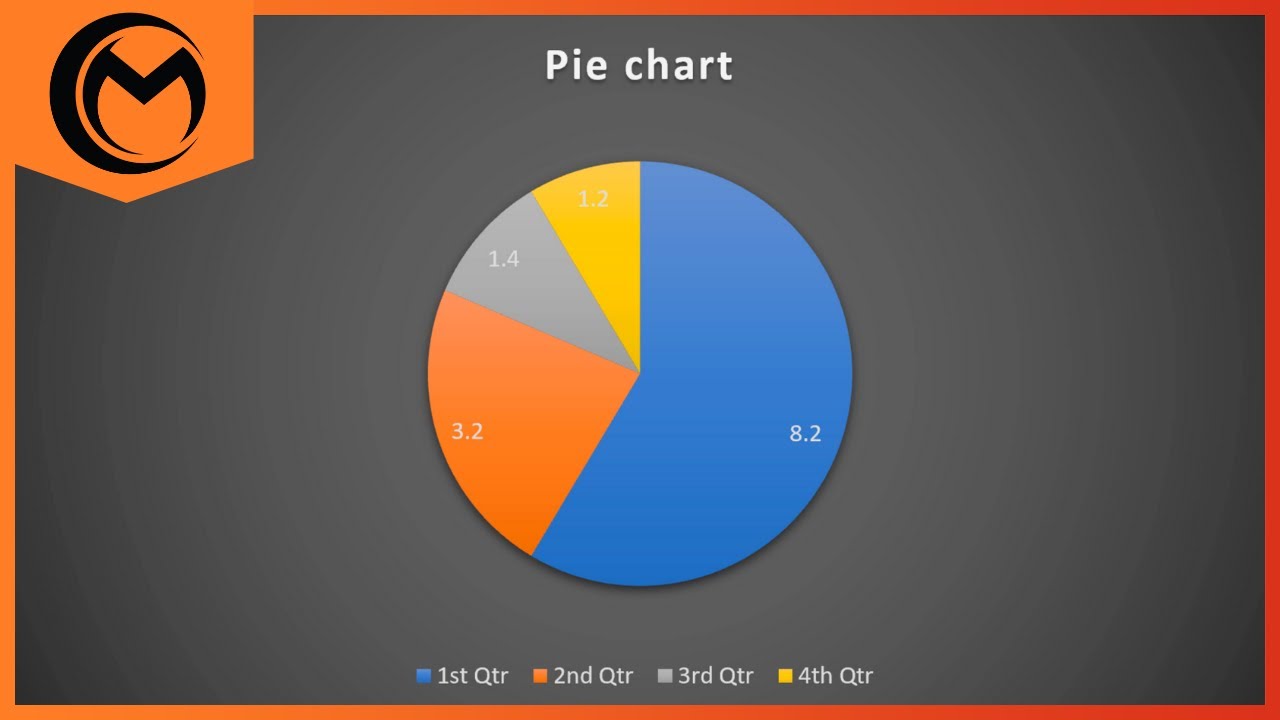
The "Category" columns are for the labels of your slices. So, if you're showing the breakdown of your budget, your categories might be "Rent," "Groceries," "Netflix Subscription" (essential, obviously), and "Miscellaneous Tiny Giraffe Collection." Be creative! The more interesting your categories, the less likely your audience is to fall asleep. Trust me, I've seen presentations where the most exciting visual was someone’s slightly askew tie. Let's not be that person.
The "Series" column is where you enter the values corresponding to each category. If your rent is $1200, you type "1200" next to "Rent." If your Netflix subscription is $15.99, you type "15.99" next to it. Word automatically calculates the proportions, turning your numbers into luscious, colorful slices.
As you type, you’ll notice the pie chart in your document updating in real-time. It’s like watching a digital soufflé rise! It’s quite mesmerizing. You can even close that spreadsheet window and re-open it later by clicking on the chart and looking for the "Edit Data" option. It's hiding in plain sight, much like that one sock that always disappears in the laundry.
Making Your Pie Pretty (or at Least Readable)
So, you've got your data in, and your pie is taking shape. But does it look… inspiring? Does it scream, "I am a masterpiece of data visualization"? Probably not yet. That's where the Chart Design and Format tabs come into play. These are your artistic palettes. Your digital paintbrushes.
First, let's tackle the colors. Nobody wants to look at a dull pie. Unless it’s a pie made of… well, let’s not go there. Click on your pie chart, and then look for the Chart Styles section under the Chart Design tab. Here, you'll find a plethora of pre-set styles. Experiment! See what tickles your fancy. Some might be a bit too… much. Others might be just right. It's like choosing an outfit for a very important data party.
Want to change individual slice colors? You can! Click on a specific slice, and then right-click. A menu will appear, and you'll see an option like Format Data Point. From there, you can get fancy with fill colors, borders, and even add effects like shadows (because even data needs a little drama, right?). Just try not to make it look like a disco ball exploded on your spreadsheet.
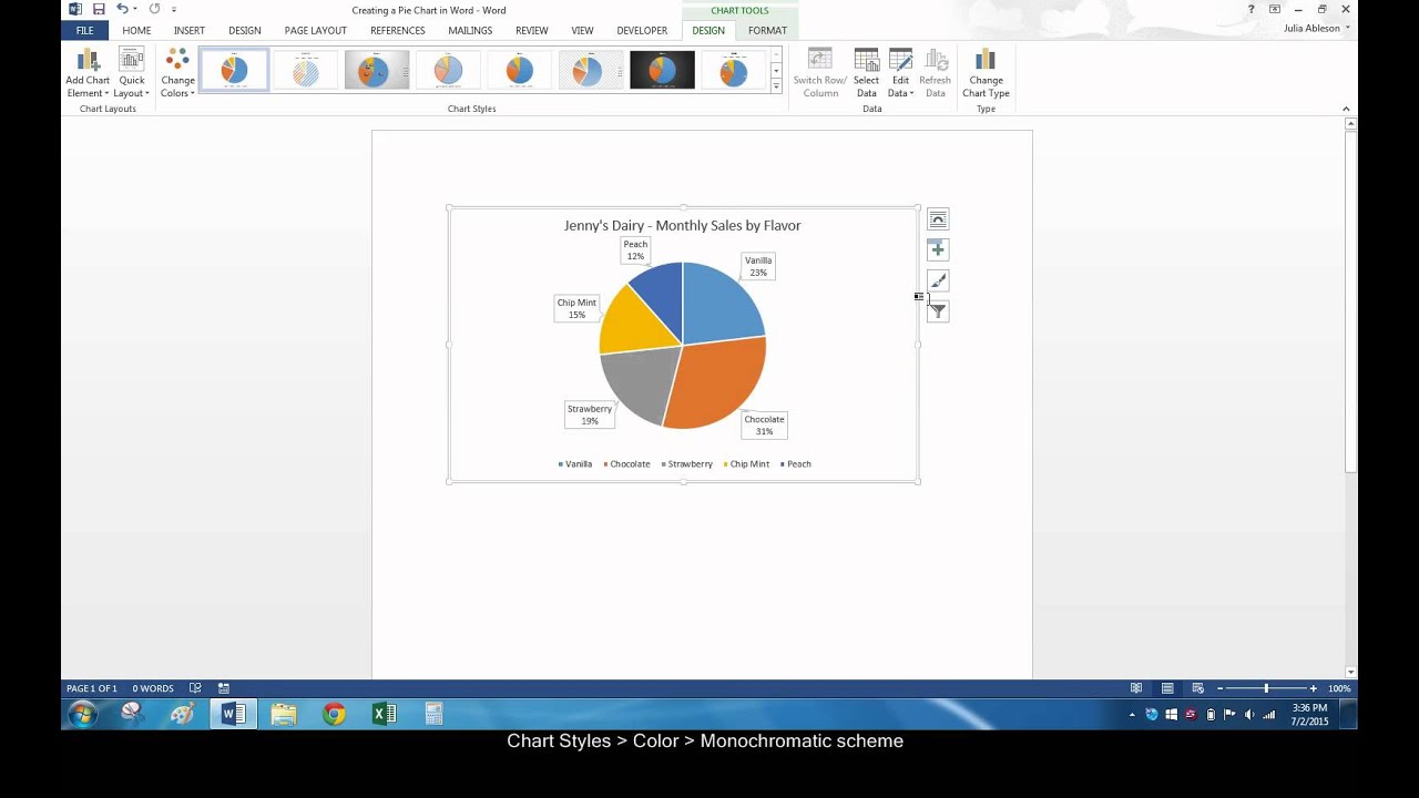
And what about those labels? Are they screaming their proportions at you, or are they whispering like shy librarians? You can adjust the Data Labels. Click on your chart, go to Add Chart Element (it’s usually on the Chart Design tab), and hover over Data Labels. You can choose to display the category name, the value, the percentage, or a combination of these. Pro tip: showing percentages is often the most intuitive for a pie chart. It’s like saying, "This is how much of the whole thing this slice represents!" Groundbreaking, I know.
Titles and Legends: The Grand Finale
Every great masterpiece needs a title, and your pie chart is no exception. Click on the default title, and give it a name that accurately, and perhaps even enticingly, describes your data. "Budget Breakdown for the Month of Infinite Coffee Consumption" is a lot more engaging than "Chart 1."
And the legend? That little box that tells you what each color means? Sometimes it's essential, sometimes it's redundant. You can control its placement or even remove it altogether if your data labels are clear enough. Again, it's under the Add Chart Element menu. Play around until it looks just right.
There you have it! You've successfully navigated the treacherous waters of Word's charting features and emerged victorious with a beautiful, informative, and hopefully delicious-looking pie chart. You've transformed raw data into a visual story. You're basically a data superhero. Now go forth and impress everyone with your newfound pie-charting prowess. Just remember, with great data comes great responsibility. And perhaps a craving for actual pie. You've earned it.