How To Do A Bell Curve In Excel
Ever looked at a bunch of numbers and thought, "Man, I wish this looked like a pretty hill"? Well, my friends, get ready to have your minds blown, because we're about to conquer the mighty Bell Curve right inside of Microsoft Excel! It’s easier than assembling IKEA furniture after a late-night pizza binge, I promise.
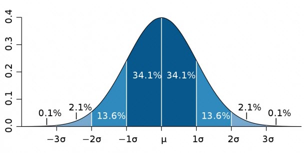
Imagine you've just surveyed your cat's napping habits. Some cats nap for a ridiculously short time, like a lightning bolt of slumber. Others, the true pros, nap for ages, practically achieving a state of zen hibernation. Most, however, fall somewhere in the middle, enjoying a perfectly respectable snooze. That, my friends, is the magic of the bell curve in action!
So, let's dive in, shall we? No need to put on your lab coat; your comfy sweatpants will do just fine. We’re going on a numerical adventure!
Must Read
Gathering Your Glorious Data
First things first, you need your numbers! This could be anything. The number of times your dog barks at squirrels, the scores on your cousin's epic game of charades, or even how many times you actually remembered to water your plant this week. Whatever your data, get it neatly organized into a single column in your Excel spreadsheet. Think of this column as your personal data treasure chest.
Let's say we’re tracking the heights of a troupe of circus acrobats. Short ones, tall ones, and a whole lot of 'just right' ones. We'll have a column labeled "Acrobat Heights" with all their dizzying elevations. Make sure there are no typos or weird characters messing things up – Excel is a bit of a perfectionist.
Once your data is in its shiny new home, it's time to let Excel do some heavy lifting. We're not going to manually sort or count anything. That's like trying to knit a sweater with chopsticks.
Unleashing the Power of the Histogram
Our secret weapon for creating a bell curve is a fantastic tool called a Histogram. Don't let the name scare you; it's less intimidating than a rogue banana peel on a polished floor. A histogram is basically a bar chart that shows how often different ranges of values appear in your data. It's like giving your numbers a popularity contest.
To get this party started, click on your column of data. Then, navigate to the "Data" tab at the top of your Excel window. See that "Data Analysis" group? If you don't see it, don't panic! This is a common little hiccup, and we’ll tackle it in a moment.
For now, imagine you've clicked "Data Analysis" and a magical list of options appears. Go ahead and select "Histogram". It’s right there, waiting for its moment to shine.
Setting Up Your Histogram Wizard
Now, a little box will pop up, like a friendly genie granting your visual wishes. This is where you tell Excel what to do. First, you'll see a field called "Input Range". This is where you tell Excel where your glorious data lives.

Simply click inside that box and then drag your mouse to select all the cells containing your acrobat heights. Make sure you select the entire column, or at least all the numbers you want to analyze. Excel will magically fill in the range for you, looking something like $A$1:$A$50. Impressive, right?
Next up is the "Bin Range". This is a bit like telling Excel how many buckets you want to sort your numbers into. If you skip this, Excel will make its own decisions, which can sometimes be… adventurous. For a nice, smooth bell curve, it’s best to define your own bins.
Crafting Your Perfect Bins
So, how do you create these magical bins? You'll need another column in your spreadsheet, maybe to the right of your acrobat heights. In this new column, you'll enter the upper limits of each of your desired data ranges. Think of them as the maximum height for each "bin."
For our acrobat example, if our shortest acrobat is 5'5" and our tallest is 6'8", we might want bins like 5'6", 5'8", 5'10", and so on, up to, say, 6'10". This creates nice, even intervals. So, in your new "Bin Range" column, you'd type 5.5, 5.6, 5.7 (if you're using feet and inches as decimals) or whatever your chosen increments are.
Once you've filled that bin column with your chosen upper limits, go back to your Histogram dialog box. Click inside the "Bin Range" field and then select all the cells containing your bin numbers. Excel, the ever-helpful assistant, will put those in the box for you.
The Grand Finale: Chart It Up!
Almost there! Now, look for the "Output Options". This is where you tell Excel where you want your beautiful bell curve to appear. You can choose "New Worksheet Ply" for a fresh start, or "Output Range" to have it pop up in your current sheet. For clarity, a new sheet is often a good idea.
And the most crucial part for our bell curve quest: make sure the "Chart Output" box is checked! This is what tells Excel to actually draw the picture for us. Without this, you'll just get a table of numbers, which is useful, but not nearly as visually pleasing.
Hit "OK", and behold! If you’ve done everything right, a magnificent chart will appear. It will look like a series of bars, and if your data is typical, those bars will start small, get taller in the middle, and then get smaller again, forming that iconic, glorious bell curve.
The Mystery of the Missing Data Analysis Tool
Now, about that missing "Data Analysis" tool – don't you worry your pretty little head about it! It's a common oversight, and incredibly easy to fix. This feature is actually an add-in, meaning it's not loaded by default.
To get it back, go to the "File" tab, then click on "Options". In the Excel Options window, find "Add-Ins" on the left-hand side. At the bottom of that window, where it says "Manage: Excel Add-ins," click the "Go..." button.
A new little box will pop up. Make sure the checkbox next to "Analysis ToolPak" is ticked. Click "OK", and just like that, the "Data Analysis" button will magically reappear on your "Data" tab, ready to serve your bell-curving needs! You're now a master of Excel wizardry!
So there you have it! You've just created a bell curve in Excel, transforming a jumble of numbers into a beautiful, insightful visual representation. Whether you're analyzing acrobat heights, cat naps, or your latest baking experiment's success rate, the bell curve is your new best friend. Go forth and visualize, you magnificent data wizards!