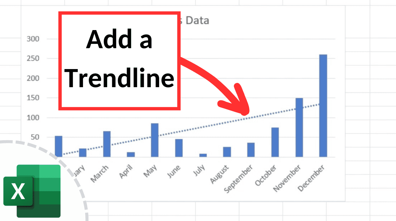
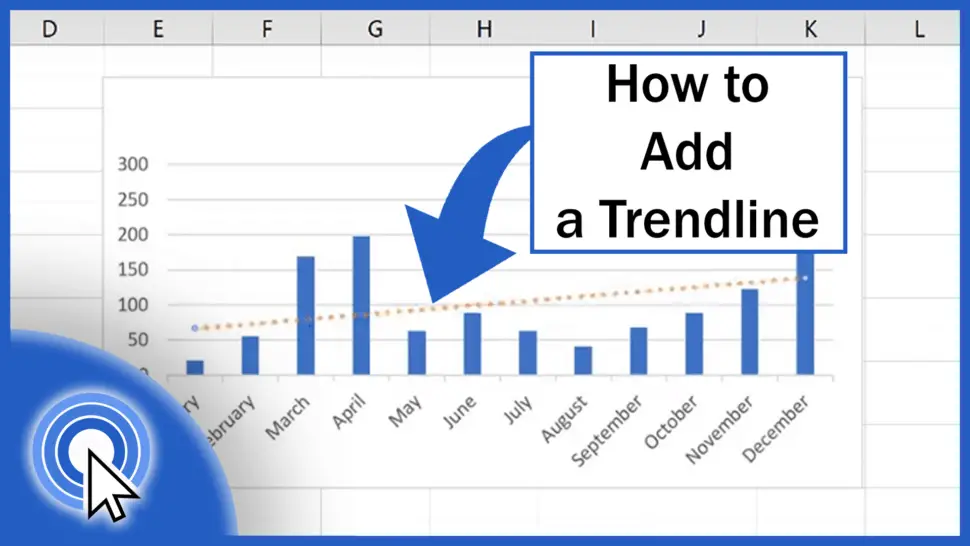
How To Add A Trendline On Excel
Ever stare at a bunch of numbers in Excel and feel like you're looking at a secret code? We've all been there! It's like a data jungle, and you're desperately searching for a clear path. Well, get ready to ditch the machete and embrace a little magic because we're about to unlock a superpower in Excel: the trusty Trendline!
Think of it like this: your data points are a scattered collection of clues at a detective's desk. You've got footprints here, a stray hair there, maybe a smudge on a teacup. A trendline is like the detective's flashlight, shining a beam to reveal the hidden pattern connecting all those little pieces. Suddenly, what looked like chaos starts to make sense! It's like finding the treasure map in a pile of old scrolls.
So, how do we summon this data-whispering wizardry? It’s surprisingly simple, I promise! You don't need to be a math whiz or have a PhD in statistics. Honestly, if you can click a mouse and navigate a website, you can totally do this. We're talking about a few clicks, a sprinkle of understanding, and boom! Your data will start talking to you like a long-lost friend.
Must Read
Let's imagine you've been tracking your daily ice cream consumption versus the temperature outside. On a scorching hot day, you're practically a human ice cream sundae, right? On a chilly day, maybe just a small scoop. You've dutifully logged all these glorious (or perhaps slightly guilty) facts into your Excel spreadsheet.
Now, you've got a scatter of dots representing your sweet, frozen adventures. You can see a general upward climb as the temperature rises, but it's not perfectly straight. This is where our star player, the Trendline, swoops in to save the day (and your understanding of your dessert habits).
First things first, you need to have your data set up. This usually means having one column for your horizontal axis (like temperature) and another for your vertical axis (like ice cream scoops). Make sure these are neatly organized. No jumbled messes allowed in the land of trendlines!
Once your data is looking spiffy, it's time to make those data points come alive. You'll want to select the data you want to analyze. This might be your entire ice cream and temperature table, or just specific columns. Think of it as highlighting the suspects in your detective case.
With your data selected, cast your gaze towards the top of your Excel screen. You'll see a ribbon of options, a veritable smorgasbord of tools. We're heading for the "Insert" tab. It's usually pretty easy to spot, often marked with a cheerful little plus sign or a picture of a chart.
Clicking on "Insert" will reveal a whole new world of chart possibilities. You'll see icons for bar charts, pie charts, and all sorts of graphical goodness. For our trendline adventure, we want to create a "Scatter Plot". This is the perfect canvas for showing relationships between two sets of numbers. It’s like setting up the crime scene for your data to reveal its secrets.
Go ahead and click on the scatter plot option. You’ll likely see a few different styles, but the basic one with just dots is usually our go-to. As if by magic, your numbers will transform into a visual spectacle! Suddenly, those boring digits are dancing on the screen.

Now, this is where the real fun begins! With your scatter plot chart selected, notice how new tabs pop up at the top of Excel. We're looking for something called "Chart Design" or "Chart Tools". It’s like the chart revealing its secret controls now that you’ve given it a stage.
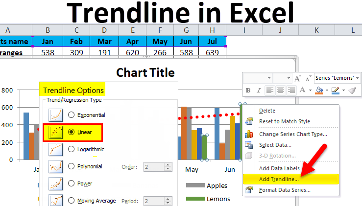
Within these chart-related tabs, you'll find an option that often says "Add Chart Element". Click on that, and a dropdown menu will appear, filled with exciting possibilities. We're hunting for "Trendline". It's hiding in plain sight, like a master of disguise!
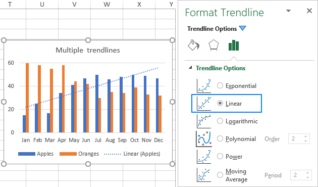
Hovering over "Trendline" will usually give you a few sub-options. You can choose a simple "Linear Trendline", which is like drawing a straight line through your data points. This is perfect for showing a steady increase or decrease, like our ice cream consumption example. It’s the simplest explanation, the most direct connection.
But wait, there's more! For more complex data, you might explore other trendline types. There are things like "Exponential", "Logarithmic", or even "Polynomial" trendlines. Think of these as different detective tools for different types of mysteries. Sometimes a straight line isn't enough; you need something that curves and bends to capture the true story.
Once you select your desired trendline type, Excel will do the heavy lifting. A line will magically appear on your chart, a smooth operator connecting your scattered dots. It’s like the data finally decided to spill the beans!
And the beauty of it? This isn't just a pretty picture. This trendline is telling you something important. It's showing you the general direction your data is heading. For our ice cream lovers, it's saying, "Yep, the hotter it gets, the more ice cream you're likely to devour!" It’s a beautiful confirmation of your culinary (and potentially caloric) habits.
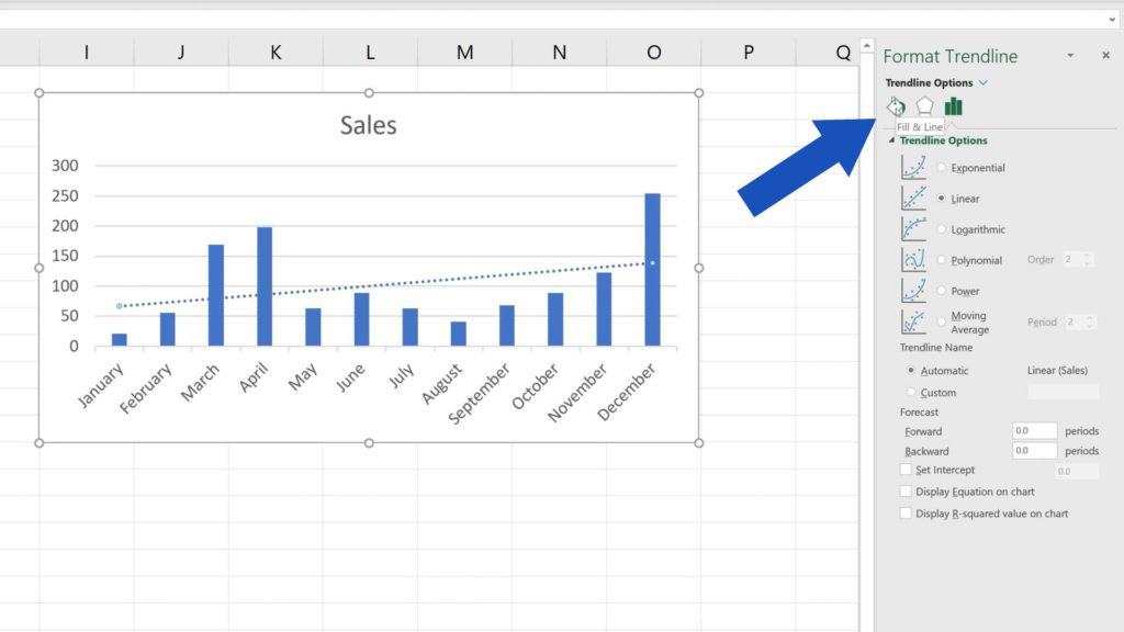
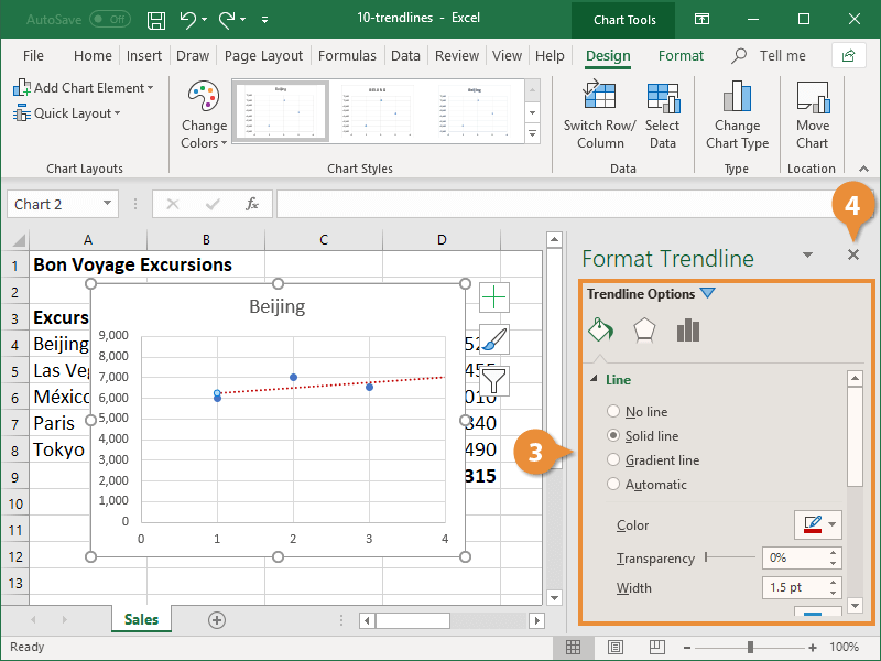
You can even go a step further and get super scientific (but still easy!). With your trendline selected, right-click on it. This will bring up a context menu, a secret handshake with your trendline. Look for "Format Trendline".
This opens up a whole panel of options. Here, you can do some really cool things. Want to see the exact mathematical equation that describes your trend? Check the box that says "Display Equation on Chart". It's like your trendline is writing its autobiography for you!
And for the data explorers out there, you can also ask Excel to show you how well that trendline actually fits your data. Look for "Display R-squared value on chart". The closer this number is to 1, the more confident you can be that your trendline is a good representation of your data's story. It’s like getting a “verified” badge for your data’s pattern!
So there you have it! You've just transformed a jumble of numbers into a visual narrative. You've gone from data novice to trendline guru in a few simple steps. It’s like you’ve learned a secret handshake with your spreadsheet, and it’s ready to reveal all its hidden connections to you.
The next time you're faced with a sea of numbers, don't despair! Remember the power of the Trendline. It’s your friendly guide, your data detective, your chart wizard, all rolled into one. Go forth and trendline with confidence, my friends! Your data will thank you for it, and you’ll feel like a certified Excel rockstar.