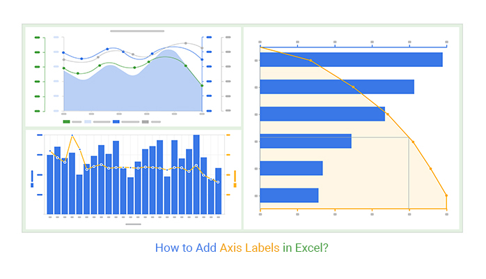
How Do You Label Axis In Excel

Hey there, data wizards and spreadsheet superstars! Ever found yourself staring at a magnificent chart in Excel, all sparkly and full of impressive numbers, but then you realize... uh oh, what does this line even mean? Or, worse yet, your boss gives you that raised-eyebrow look and asks, "So, which axis represents what again?"
Fear not, my friends! Today, we're diving into the wonderfully simple, yet oh-so-important, world of labeling those trusty axes in Excel. Think of it as giving your chart a voice, telling its story clearly and concisely. No more deciphering cryptic squiggles or playing "guess the data"! We're going to make your charts so clear, even your cat could understand them (though, let's be honest, cats are usually more interested in the cursor moving around the screen).
The Grand Entrance: Why Bother Labeling?
Seriously, why do we need to label axes? Isn't it obvious? Well, sometimes it is, and sometimes... not so much. Imagine a graph showing the population of pandas and the price of bananas over time. Without labels, you might think pandas are directly influencing banana prices, or vice-versa! While that would be a hilarious (and probably delicious) economic theory, it's probably not what your data is trying to tell you.
Must Read
Clear axis labels are the difference between a chart that impresses and a chart that... well, confuses. They tell your audience exactly what you're measuring. Are you looking at sales figures in dollars? Or maybe customer numbers in thousands? Is it time in years, months, or days? Without labels, your audience is left playing a guessing game, and nobody likes losing, especially when important decisions are on the line!
Think of it this way: you wouldn't present a gift without a card, right? Your chart deserves a little note explaining its contents. It's just polite!
The Two Musketeers: Horizontal (X) and Vertical (Y) Axes
Most of the charts you'll create in Excel will have two main axes: the horizontal one, usually at the bottom, and the vertical one, running up the side. We often call these the X-axis (horizontal) and the Y-axis (vertical). It's like a friendly duo, always working together to paint a picture of your data.
The X-axis typically represents your independent variable. This is the thing that's changing or that you're measuring over time or in different categories. Think of dates, product names, or different experimental conditions. The Y-axis, on the other hand, usually shows your dependent variable. This is what you're measuring in response to your independent variable. It's the quantity, the amount, the result!
Sometimes, especially with more complex charts, you might even have a secondary Y-axis. Don't let that freak you out! It's just there to help you plot a second set of data that might have a very different scale. We'll get to that magic later, but for now, let's master the basics.
Level 1: The "Oops, I Forgot!" Fix (When Your Chart is Already Made)
Okay, so you've made your chart, feeling all proud, and then you remember, "Oh no, I didn't label the axes!" Don't panic! Excel makes this super easy. It's like finding out you left your keys in the door – a little oops, but easily fixed.

Here's how you do it:
- Click on your chart. You'll see some new tabs appear in the Excel ribbon, usually called "Chart Design" and "Format." This is your chart's backstage!
- Go to "Chart Design." This is where all the cool chart customization magic happens.
- Look for "Add Chart Element." It's usually a button that looks like a plus sign or a little menu. Click on it!
- Hover over "Axis Titles." A sub-menu will pop up, giving you options for "Primary Horizontal," "Primary Vertical," and maybe even "Secondary Horizontal" and "Secondary Vertical."
- Select "Primary Horizontal." A little text box will appear on your X-axis. Now, you can type whatever you want! "Months," "Sales Figures (in $)," "Product Name" – the world is your oyster!
- Repeat for "Primary Vertical." Click "Add Chart Element" again, hover over "Axis Titles," and select "Primary Vertical." Another text box appears, ready for your Y-axis label.
Pro Tip: If you're feeling fancy, you can also click directly on the axis labels in the chart itself. Sometimes, they're already there but blank. Double-clicking or just clicking on them might make them editable. It's like discovering a secret shortcut!
A Little Extra Sparkle: Formatting Your Axis Titles
Once you've got your labels in, you might want to make them a bit more ... you! You can change the font, size, color, and even the orientation.
To do this:
- Click on the axis title you want to format.
- Go to the "Format" tab that appears in the ribbon.
- Explore the "WordArt Styles" and "Text Effects" sections. You can make them bold, change the color to match your company branding, or even tilt them a bit.
Just a word of caution: don't go too crazy. The goal is clarity, not a rave! Keep it readable and professional. Your cat might appreciate flashing lights, but your colleagues might not.
Level 2: The "Let's Get it Right From the Start!" Method
Why wait for the "oops" moment when you can nail it from the get-go? When you're initially creating your chart, you can set up those axis labels like a pro.

Here's the drill:
- Select your data. Highlight the cells containing the information you want to chart.
- Insert your chart. Go to the "Insert" tab and choose your desired chart type.
- Right-click on the chart. This is your universal command for chart customization.
- Choose "Select Data..." This will open a window where you can fine-tune what's going into your chart.
- Look at the "Legend Entries (Series)" and "Horizontal (Category) Axis Labels." This is where the magic happens!
For the Y-axis (Series):
In the "Legend Entries (Series)" box, you'll see your data series listed. If you have column headers above your data, Excel is pretty smart and will often pick them up as your series names (which will become your Y-axis title if you're using a column chart or a bar chart). If it hasn't, or if you want to change it, click "Edit" next to the series you want to adjust. You can then type in your desired axis title.
For the X-axis (Categories):
In the "Horizontal (Category) Axis Labels" box, click the "Edit" button. A new little window will pop up asking for "Axis label range." This is where you'll select the cells that contain your categories (like dates, names, etc.). Again, if you have headers for these categories, Excel might pick them up automatically. If not, or if you need to adjust, this is your chance!
Hot Tip: Make sure the headers in your spreadsheet are clear and descriptive. This is the easiest way to ensure Excel gets it right the first time. Treat your spreadsheet headers like the labels on your favorite snacks – you want to know what's inside without having to open it!

The Mysterious Secondary Y-Axis: When Two Worlds Collide (Nicely!)
Sometimes, you have two sets of data that are related but have wildly different scales. For example, you might want to show the number of units sold (which could be in hundreds or thousands) alongside the average price per unit (which might be in single or double digits). If you plot both on the same Y-axis, one set of data will look like a flat line, while the other will go off the charts! Not ideal.
This is where the secondary Y-axis comes to the rescue! It's like giving your chart a second ladder to climb.
Here's how to add one:
- Create your chart with one set of data.
- Add your second data series. Select your chart, go to "Chart Design," and choose "Select Data..."
- Click "Add" under "Legend Entries (Series)."
- Fill in the "Series name" (this will be the name of your second data set) and select the "Series values" for this second data set. Click "OK."
- Now, right-click on the data series that you want to move to the secondary axis. (This is the one that's currently looking a bit squished or too extreme).
- Select "Format Data Series..."
- In the "Format Data Series" pane that appears, look for "Series Options." You'll see a radio button that says "Plot Series On." Select "Secondary Axis."
Voilà! You now have a second Y-axis. You'll see a new set of numbers running up the right side of your chart. Now, you'll want to add a label to that secondary Y-axis too!
To add the secondary Y-axis title:
- Click on your chart.
- Go to "Chart Design."
- Click "Add Chart Element."
- Hover over "Axis Titles."
- Select "Secondary Vertical." A text box will appear on the right side of your chart.
Now, type in the descriptive label for your secondary Y-axis. This makes your chart tell a much more complete story!

A Word on Axis Types (Don't Overthink It!)
Excel is pretty smart about figuring out whether your axis should be a Category Axis (for things like names or dates where the spacing is usually equal) or a Value Axis (for numbers where the scale really matters). Most of the time, it gets it right.
If you ever need to change it (and trust me, it's rare you'll need to!), you can right-click on the axis, select "Format Axis," and then look for "Axis Type." But honestly, for most of your everyday charting needs, Excel's default is your best friend. Don't let the jargon scare you; focus on making those labels clear!
The Power of a Good Label: Final Thoughts
So there you have it! Labeling your axes in Excel is not some arcane art form. It's a straightforward process that makes a world of difference in how your data is understood.
Think of it this way: a well-labeled chart is like a perfectly brewed cup of coffee – it's just right, enjoyable, and gives you the boost you need. A poorly labeled chart is like a cup of coffee with way too much sugar and a random sprinkle of salt – confusing and a bit off-putting!
By taking just a few extra moments to add clear, descriptive labels, you're not only making your charts easier to understand, but you're also showing your audience that you respect their time and their intelligence. You're saying, "Here's the story my data wants to tell, and I'm going to make it as easy as possible for you to hear it!"
So go forth, my friends! Create those beautiful, informative charts. Label those axes with pride and clarity. And remember, with every well-labeled chart you create, you're one step closer to becoming a true data whisperer. You've got this, and your charts will thank you for it!